For some quiz shows of the german broadcast station Norddeutscher Rundfunk I produced numerous limited animation clips in the years 2007 to 2009.
Production process
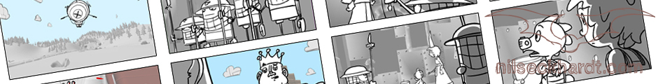
With 35 to 45 seconds length each and a tight deadline, there was less than one and a half weeks to put one of them together. This included character design, storyboard, animatic, limited animation, backgrounds, clean up, coloration and compositing.
You will notice some strange compositions with parts of the screen staying empty. They result from the way the clips were used in the „NDR Bibelquiz“ and „NDR Deutschlandquiz“. Some prominents were inserted to my movies via green screen explaining the answers to the asked questions. The clips playing in the background told a little story or just supported the explanations visually.
Character Design


The character design was big fun because I had to create loads of adaptions of famous historical and biblical people in a comic style, such as Jesus, Martin Luther (not King!), John the Baptist, Mary, Barbarossa, Karl Marx, Moses, the Devil, Brothers Grimm, Klaus Störtebecker, Alexander von Humboldt, Catherine the Great and others.
A nice project with quite a challenge in the planning process. I’d like to do more of those 😉
(Thanks to my team for the support at in betweening, digitising and coloration.)
Animation sequences of the showreel taken from the “NDR Bibelquiz” and “NDR Deutschlandquiz”.
All rights reserved by Norddeutscher Rundfunk.
Music track “Swinging Hammock” taken from freesfx.co.uk